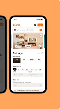
Basic building block for your ideas.
Basic building block for your ideas.
Bland gives you core components to bring your ideas to life, skipping the fancy stuff to focus on the essentials. Our components let you design freely, making sure you are in control the whole time.
I am giving a warning here
Core features
Made to address your design needs from the ground up.
Bland was built with all these in mind.
Barebones components
Components are simplified to the basics, allowing you to style them to fit your needs.
The essentials
Everything you need to get started: color, typography, spacing, icons, effects...
Variables
Use variables in Figma to gain even greater control over your design tokens.
Responsive
Designed with Autolayout to adapt, whether you enlarge or shrink within reasonable limits.
Variants and properties
Components come with variants and properties to accommodate a wide range of use cases.
Open-source icons
Makes use of the MIT-licensed Lucide icons, ensuring open-source flexibility.
Constantly updated
Components and it’s documentation will keep getting better with every update.
Support
Reach out anytime to give feedback, ask for assistance, or make a request.
Interact with these templates
Coming soon...
Built with Bland
Here’s some of what you can build. We just give you the essentials.


How to use
Here’s quick video on how to use this UI Kit.
Check out our YouTube channel for more tutorials and other related content
Coming soon